Check Box
Overview
A check box is a type of button used to enter or display binary (true-false) data. Basically, it is either checked or unchecked, but a third state can be defined (see below).
Check boxes are controlled by methods. Like all buttons, a check box variable is set to 0 when the form is first opened. The method associated with it executes when the check box is selected.
A check box displays text next to a small square. This text is set in the Title property of the check box. You can enter a title in the form of an XLIFF reference in this area (see Appendix B: XLIFF architecture).
Using check boxes
A check box can be associated to a variable or expression of type integer or boolean.
- integer: if the box is checked, the variable has the value 1. When not checked, it has the value 0. If check box is in third state (see below), it has the value 2.
- boolean: if the box is checked, the variable has the value
True. When not checked, it has the valueFalse.
Any or all check boxes in a form can be checked or unchecked. Multiple check boxes allow the user to select multiple options.
Three-States check box
Check box objects with style Regular and Flat accept a third state. This third state is an intermediate status, which is generally used for display purposes. For example, it allows indicating that a property is present in a selection of objects, but not in each object of the selection.

To enable this third state, you must select the Three-States property.
This property is only available for regular and flat check boxes associated with numeric variables or expressions — check boxes for Boolean expressions cannot use the Three-States property (a Boolean expression cannot be in an intermediary state).
The variable associated with the check box returns the value 2 when the check box is in the third state.
In entry mode, the Three-States check boxes display each state sequentially, in the following order: unchecked / checked / intermediary / unchecked, etc. The intermediary state is generally not very useful in entry mode; in the code, simply force the value of the variable to 0 when it takes the value of 2 in order to pass directly from the checked state to the unchecked state.
Using a standard action
You can assign a standard action to a check box to handle attributes of text areas. For example, if you assign the fontBold standard action, at runtime the check box will manage the "bold" attribute of the selected text in the current area.
Only actions that can represent a true/false status ("checkable" actions) are supported by this object:
| Supported actions | Usage condition (if any) |
|---|---|
| avoidPageBreakInsideEnabled | 4D Write Pro areas only |
| fontItalic | |
| fontBold | |
| fontLinethrough | |
| fontSubscript | 4D Write Pro areas only |
| fontSuperscript | 4D Write Pro areas only |
| fontUnderline | |
| font/showDialog | Mac only |
| htmlWYSIWIGEnabled | 4D Write Pro areas only |
| section/differentFirstPage | 4D Write Pro areas only |
| section/differentLeftRightPages | 4D Write Pro areas only |
| spell/autoCorrectionEnabled | |
| spell/autoDashSubstitutionsEnabled | Mac only |
| spell/autoLanguageEnabled | Mac only |
| spell/autoQuoteSubstitutionsEnabled | Mac only |
| spell/autoSubstitutionsEnabled | |
| spell/enabled | |
| spell/grammarEnabled | Mac only |
| spell/showDialog | Mac only |
| spell/visibleSubstitutions | |
| visibleBackground | 4D Write Pro areas only |
| visibleFooters | 4D Write Pro areas only |
| visibleHeaders | 4D Write Pro areas only |
| visibleHiddenChars | 4D Write Pro areas only |
| visibleHorizontalRuler | 4D Write Pro areas only |
| visiblePageFrames | 4D Write Pro areas only |
| visibleReferences | |
| widowAndOrphanControlEnabled | 4D Write Pro areas only |
For detailed information on these actions, please refer to the Standard actions section.
Check box button styles
Check box styles control a check box's general appearance as well as its available properties. It is possible to apply different predefined styles to check boxes. A great number of variations can be obtained by combining these properties / behaviors.
With the exception of the available properties, many check box objects are structurally identical. The difference is in the processing of their associated variables.
4D provides check boxes in the following predefined styles:
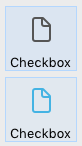
Regular
The Regular check box style is a standard system check box (i.e., a rectangle with a descriptive title):

JSON Example
 "myCheckBox": {
  "type": "checkbox",
  "style":"regular",
  "text": "Cancel",
  "action": "Cancel",
  "left": 60,
  "top": 160,
  "width": 100,
  "height": 20
  "dataSourceTypeHint":"boolean"
  }
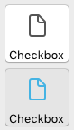
Flat
The Flat check box style is a minimalist appearance. The Flat style's graphic nature is particularly useful for forms that will be printed.
JSON Example
 "myCheckBox": {
   "type": "checkbox",
   "style":"flat",
   "text": "Cancel",
   "action": "cancel",
   "left": 60,
    "top": 160,
    "width": 100,
   "height": 20
   }
Toolbar button
The Toolbar button check box style is primarily intended for integration in a toolbar.
The Toolbar style has a transparent background with a title. It is usually associated with a 4-state picture.
Example with states unchecked / checked / highlighted:

JSON Example
 "myCheckBox": {
                "type": "checkbox",
                "style":"toolbar",
                "text": "Checkbox",
    "icon": "/RESOURCES/File.png",
    "iconFrames": 4
                "left": 60,
                "top": 160,
                "width": 100,
                "height": 20
                }
Bevel
The Bevel check box style combines the appearance of the Regular (i.e., a rectangle with a descriptive title) style with the Toolbar style's behavior.
The Bevel style has a light gray background with a title. It is usually associated with a 4-state picture.
Example with states unchecked / checked / highlighted:

JSON Example
 "myCheckBox": {
                "type": "checkbox",
                "style":"bevel",
                "text": "Checkbox",
     "icon": "/RESOURCES/File.png",
    "iconFrames": 4
               "left": 60,
                "top": 160,
                "width": 100,
                "height": 20
                }
Rounded Bevel
The Rounded Bevel check box style is nearly identical to the Bevel style except, depending on the OS, the corners of the button may be rounded. As with the Bevel style, the Rounded Bevel style combines the appearance of the Regular style with the Toolbar style's behavior.
The Rounded Bevel style has a light gray background with a title. It is usually associated with a 4-state picture.
Example on macOS:
on Windows, the Rounded Bevel style is identical to the Bevel style.
JSON Example
 "myCheckBox": {
                "type": "checkbox",
                "style":"roundedBevel",
                "text": "Checkbox",
     "icon": "/RESOURCES/File.png",
    "iconFrames": 4
                "left": 60,
                "top": 160,
                "width": 100,
                "height": 20
                }
OS X Gradient
The OS X Gradient check box style is nearly identical to the Bevel style except, depending on the OS, it may have a two-toned appearance. As with the Bevel style, the OS X Gradient style combines the appearance of the Regular style with the Toolbar style's behavior.
The OS X Gradient style has a light gray background with a title and is displayed as a two-tone system button on macOS. It is usually associated with a 4-state picture.

On Windows, this style is identical to the Bevel style.
JSON Example
 "myCheckBox": {
   "type": "checkbox",
   "style":"gradientBevel",
   "text": "Checkbox",
   "icon": "/RESOURCES/File.png",
   "iconFrames": 4
   "left": 60,
   "top": 160,
   "width": 100,
   "height": 20
           }
OS X Textured
The OS X Textured checkbox style is similar to the Bevel style except, depending on the OS, it may have a different appearance. As with the Bevel style, the OS X Textured style combines the appearance of the Regular style with the Toolbar style's behavior.
By default, the OS X Textured style appears as:
-
Windows - a standard system button with a light blue background with a title in the center.

-
macOS - a standard system button displaying a color change from light to dark gray. Its height is predefined: it is not possible to enlarge or reduce it.

JSON Example
 "myCheckBox": {
   "type": "checkbox",
   "style":"texturedBevel",
   "text": "Checkbox",
   "left": 60,
   "top": 160,
   "width": 100,
   "height": 20
   }
Office XP
The Office XP check box style combines the appearance of the Regular style with the Toolbar style's behavior.
The colors (highlight and background) of a button with the Office XP style are based on the system colors. The appearance of the button can be different when the cursor hovers over it depending on the OS:
-
Windows - its background only appears when the mouse rolls over it. Example with states unchecked / checked / highlighted:

-
macOS - its background is always displayed. Example with states unchecked / checked:
JSON Example
 "myCheckBox": {
                "type": "checkbox",
                "style":"office",
                "text": "Checkbox",
                "action": "fontBold",
     "icon": "/RESOURCES/File.png",
    "iconFrames": 4
               "left": 60,
                "top": 160,
                "width": 100,
                "height": 20
                }
Collapse / Expand
This check box style can be used to add a standard collapse/expand icon. These buttons are used natively in hierarchical lists.
-
Windows - the button looks like a [+] or a [-]

-
macOS - it looks like a triangle pointing right or down.

JSON Example
 "myCheckBox": {
                "type": "checkbox",
                "style":"disclosure",
    "method": "m_collapse",
    "left": 60,
                "top": 160,
                "width": 100,
                "height": 20
                }
Disclosure Button
In macOS and Windows, a check box with the "Disclosure" style appears as a standard disclosure button, usually used to show/hide additional information. When used as a radio button, the button symbol points downwards with value 0 and upwards with value 1.
- Windows
- macOS

JSON Example
 "myCheckBox": {
                "type": "checkbox",
                "style":"roundedDisclosure",
    "method": "m_disclose",
                "left": 60,
                "top": 160,
                "width": 100,
                "height": 20
                }
Custom
The Custom check box style accepts a personalized background picture and allows managing specific properties:
It is usually associated with a 4-state picture, that can be used in conjunction with a 4-state background picture.
JSON Example
 "myCheckbox": {
  "type": "checkbox",
  "style":"custom",
  "text": "OK",
  "icon": "/RESOURCES/smiley.jpg",
  "iconFrame": 4,
  "customBackgroundPicture": "/RESOURCES/paper.jpg",
  "iconOffset": 5, //custom icon offset when clicked
  "left": 60,
  "top": 160,
  "width": 100,
  "height": 20,
  "customBorderX": 20,
  "customBorderY": 5
  }
Supported Properties
All check boxes share the same set of basic properties:
Bold - Bottom - Button Style - Class - Focusable - Font - Font Color - Font Size - Height - Help Tip - Horizontal Sizing - Italic - Left - Object Name - Right - Shortcut - Standard action - Title - Top - Type - Underline - Variable or Expression - Vertical Sizing - Visibility - Width
Additional specific properties are available, depending on the button style:
- Background pathname - Horizontal Margin - Icon Offset - Vertical Margin (Custom)
- Three-States (Flat, Regular)
- Number of States - Picture pathname - Title/Picture Position (Toolbar button, Bevel, Rounded Bevel, OS X Gradient, OS X Textured, Office XP, Custom)