Input
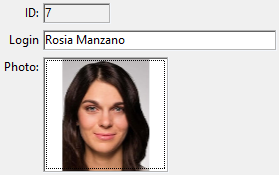
Inputs allow you to add enterable or non-enterable expressions such as database fields and variables to your forms. Inputs can handle character-based data (text, dates, numbers...) or pictures:

Inputs can contain assignable or non-assignable expressions.
In addition, inputs can be enterable or non-enterable. An enterable input accepts data. You can set data entry controls for the object. A non-enterable input can only display values but cannot be edited by the user.
You can manage the data with object or form methods.
JSON Example:
	"myText": {
		"type": "input",	//define the type of object
		"spellcheck": true,	//enable spelling verification
		"left": 60,			//left position on the form
		"top": 160,			//top position on the form
		"width": 100,		//width of the object
		"height": 20		//height of the object
		}
Supported Properties
History
| Release | Changes |
|---|---|
| 19 R7 | Support of Corner radius property |
Allow font/color picker - Alpha Format - Auto Spellcheck - Background Color - Bold - Boolean format - Border Line Style - Bottom - Choice List - Class - Context Menu - Corner radius - Date Format - Default value - Draggable - Droppable - Enterable - Entry Filter - Excluded List - Expression type - Fill Color - Font - Font Color - Font Size - Height - Hide focus rectangle - Horizontal Alignment - Horizontal Scroll Bar - Horizontal Sizing - Italic - Left - Multiline - Multi-style - Number Format - Object Name - Orientation - Picture Format - Placeholder - Print Frame - Required List - Right - Selection always visible - Store with default style tags - Text when False/Text when True - Time Format - Top - Type - Underline - Variable or Expression - Vertical Scroll Bar - Vertical Sizing - Visibility - Width - Wordwrap
Input alternatives
You can also represent field and variable expressions in your forms using alternative objects, more particularly:
- You can display and enter data from database fields directly in columns of selection type List boxes.
- You can represent a list field or variable directly in a form using Pop-up Menus/Drop-down Lists and Combo Boxes objects.
- You can represent a boolean expression as a check box or as a radio button object.