Button Grid
A button grid is a transparent object that is placed on top of a graphic. The graphic should depict a row-by-column array. When one of the graphics is clicked on, it will have a sunken or pressed appearance:

You can use a button grid object to determine where the user clicks on the graphic. The object method would use the On Clicked event and take appropriate action depending on the location of the click.
Creating button grids
To create the button grid, add a background graphic to the form and place a button grid on top of it. Specify the number of rows and columns.
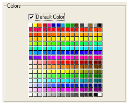
In 4D, a button grid is used as a color palette:
Using button grids
The buttons on the grid are numbered from top left to bottom right. In the above example, the grid is 16 columns across by 16 rows down. The button in the top-left position returns 1 when clicked. If the red button at the far right of the second row is selected, the button grid returns 32. If no element is selected, the value is 0
Goto page
You can assign the gotoPage standard action to a button grid. When this action is selected, 4D will automatically display the page of the form that corresponds to the number of the button that is selected in the button grid. For example, if the user selects the tenth button of the grid, 4D will display the tenth page of the current form (if it exists).
Supported Properties
Border Line Style - Bottom - Class - Columns - Height - Help Tip - Horizontal Sizing - Left - Object Name - Right - Rows - Standard action - Top - Type - Variable or Expression - Vertical Sizing - Width - Visibility
Supported Events
On Begin Drag Over - On Clicked - On Double Clicked - On Drag Over - On Drop - On Header - On Load - On Getting focus - On Mouse Enter - On Mouse Leave - On Mouse Move - On Printing Break - On Printing Detail - On Printing Footer - On Unload - On Validate