Input
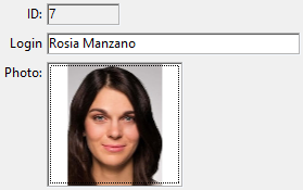
Inputs allow you to add enterable or non-enterable expressions such as database fields and variables to your forms. Inputs can handle character-based data (text, dates, numbers...) or pictures:
Inputs can contain assignable or non-assignable expressions.
In addition, inputs can be enterable or non-enterable. An enterable input accepts data. You can set data entry controls for the object. A non-enterable input can only display values but cannot be edited by the user.
You can manage the data with object or form methods.
For security reasons, in multi-style input areas, when formulas are pasted from a different 4D application or an external environment, only the computed values (text or images) available at the time of copying are pasted. If no value was available (e.g., the formula was never computed), 4D pastes the formula source as plain text.
JSON Example:
	"myText": {
		"type": "input",	//define the type of object
		"spellcheck": true,	//enable spelling verification
		"left": 60,			//left position on the form
		"top": 160,			//top position on the form
		"width": 100,		//width of the object
		"height": 20		//height of the object
		}
Supported Properties
History
| Release | Changes |
|---|---|
| 20 R4 | Support of Writing Tools property |
| 19 R7 | Support of Corner radius property |
Allow font/color picker - Alpha Format - Auto Spellcheck - Background Color - Bold - Boolean format - Border Line Style - Bottom - Choice List - Class - Context Menu - Corner radius - Date Format - Default value - Draggable - Droppable - Enterable - Entry Filter - Excluded List - Expression type - Fill Color - Font - Font Color - Font Size - Height - Hide focus rectangle - Horizontal Alignment - Horizontal Scroll Bar - Horizontal Sizing - Italic - Left - Multiline - Multi-style - Number Format - Object Name - Orientation - Picture Format - Placeholder - Print Frame - Required List - Right - Selection always visible - Store with default style tags - Text when False/Text when True - Time Format - Top - Type - Underline - Variable or Expression - Vertical Scroll Bar - Vertical Sizing - Visibility - Width - Wordwrap - Writing Tools
Supported Events
On After Edit - On After Keystroke - On Before Keystroke - On Begin Drag Over - On Clicked - On Data Change - On Double Clicked - On Drag Over - On Drop - On Getting focus - On Header - On Load - On Losing focus - On Mouse Enter - On Mouse Leave - On Mouse Move - On Mouse Up (Picture type only)- On Printing Break - On Printing Detail - On Printing Footer - On Scroll(Picture type only) - On Selection Change - On Unload - On Validate
Input alternatives
You can also represent field and variable expressions in your forms using alternative objects, more particularly:
- You can display and enter data from database fields directly in columns of selection type List boxes.
- You can represent a list field or variable directly in a form using Pop-up Menus/Drop-down Lists and Combo Boxes objects.
- You can represent a boolean expression as a check box or as a radio button object.