Coordinates & Sizing
Automatic Row Height
This property is only available for list boxes with the following data sources:
- collection or entity selection,
- array (non-hierarchical).
The property is not selected by default. When used for at least one column, the height of every row in the column will automatically be calculated by 4D, and the column contents will be taken into account. Note that only columns with the option selected will be taken into account to calculate the row height.
When resizing the form, if the "Grow" horizontal sizing property was assigned to the list box, the right-most column will be increased beyond its maximum width if necessary.
When this property is enabled, the height of every row is automatically calculated in order to make the cell contents entirely fit without being truncated (unless the Wordwrap option is disabled.
-
The row height calculation takes into account:
- any content types (text, numerics, dates, times, pictures (calculation depends on the picture format), objects),
- any control types (inputs, check boxes, lists, dropdowns),
- fonts, fonts styles and font sizes,
- the Wordwrap option: if disabled, the height is based on the number of paragraphs (lines are truncated); if enabled, the height is based on number of lines (not truncated).
-
The row height calculation ignores:
- hidden column contents
- Row Height and Row Height Array properties (if any) set either in the Property list or by programming.
Since it requires additional calculations at runtime, the automatic row height option could affect the scrolling fluidity of your list box, in particular when it contains a large number of rows.
JSON Grammar
| Name | Data Type | Possible Values |
|---|---|---|
| rowHeightAuto | boolean | true, false |
Objects Supported
Commands
LISTBOX Get property - LISTBOX SET PROPERTY
Bottom
Bottom coordinate of the object in the form.
JSON Grammar
| Name | Data Type | Possible Values |
|---|---|---|
| bottom | number | minimum: 0 |
Objects Supported
4D View Pro Area - 4D Write Pro Area - Button - Button Grid - Check Box - Combo Box - Dropdown list - Group Box - Hierarchical List - Input - List Box - Line - List Box Column - Oval - Picture Button - Picture Pop up menu - Plug-in Area - Progress Indicators - Radio Button - Rectangle - Ruler - Spinner - Splitter - Static Picture - Stepper - Subform - Tab control - Text Area - Web Area
Commands
OBJECT GET COORDINATES - OBJECT MOVE - OBJECT SET COORDINATES
Left
Left coordinate of the object on the form.
JSON Grammar
| Name | Data Type | Possible Values |
|---|---|---|
| left | number | minimum: 0 |
Objects Supported
4D View Pro Area - 4D Write Pro Area - Button - Button Grid - Check Box - Combo Box - Dropdown list - Group Box - Hierarchical List - Input - List Box - Line - List Box Column - Oval - Picture Button - Picture Pop up menu - Plug-in Area - Progress Indicators - Radio Button - Ruler - Rectangle - Spinner - Splitter - Static Picture - Stepper - Subform - Tab control - Text Area - Web Area
Commands
OBJECT GET COORDINATES - OBJECT MOVE - OBJECT SET COORDINATES
Right
Right coordinate of the object in the form.
JSON Grammar
| Name | Data Type | Possible Values |
|---|---|---|
| right | number | minimum: 0 |
Objects Supported
4D View Pro Area - 4D Write Pro Area - Button - Button Grid - Check Box - Combo Box - Dropdown list - Group Box - Hierarchical List - Input - List Box - Line - List Box Column - Oval - Picture Button - Picture Pop up menu - Plug-in Area - Progress Indicators - Radio Button - Ruler - Rectangle - Spinner - Splitter - Static Picture - Stepper - Subform - Tab control - Text Area - Web Area
Commands
OBJECT GET COORDINATES - OBJECT MOVE - OBJECT SET COORDINATES
Top
Top coordinate of the object in the form.
JSON Grammar
| Name | Data Type | Possible Values |
|---|---|---|
| top | number | minimum: 0 |
Objects Supported
4D View Pro Area - 4D Write Pro Area - Button - Button Grid - Check Box - Combo Box - Dropdown list - Group Box - Hierarchical List - Input - List Box - Line - List Box Column - Oval - Picture Button - Picture Pop up menu - Plug-in Area - Progress Indicators - Radio Button - Ruler - Rectangle - Spinner - Splitter - Static Picture - Stepper - Subform - Tab control - Text Area - Web Area
Commands
OBJECT GET COORDINATES - OBJECT MOVE - OBJECT SET COORDINATES
Corner Radius
History
| Release | Changes |
|---|---|
| 19 R7 | Support for inputs and text areas |
Defines the corner roundness (in pixels) of the object. By default, the radius value is 0 pixels. You can change this property to draw rounded objects with custom shapes:

Minimum value is 0, in this case a standard non-rounded object rectangle is drawn. Maximum value depends on the rectangle size (it cannot exceed half the size of the shortest rectangle side) and is calculated dynamically.
With text areas and inputs:
- the corner radius property is only available with "none", "solid", or "dotted" border line styles,
- the corner roundness is drawn outside the area of the object (the object appears larger in the form but its width and height are not extended).

You can also set this property using the OBJECT Get corner radius and OBJECT SET CORNER RADIUS commands.
JSON Grammar
| Name | Data Type | Possible Values |
|---|---|---|
| borderRadius | integer | minimum: 0 |
Objects Supported
Commands
OBJECT GET CORNER RADIUS - OBJECT SET CORNER RADIUS
Height
This property designates an object's vertical size.
Some objects may have a predefined height that cannot be altered.
JSON Grammar
| Name | Data Type | Possible Values |
|---|---|---|
| height | number | minimum: 0 |
Objects Supported
4D View Pro Area - 4D Write Pro Area - Button - Button Grid - Check Box - Combo Box - Dropdown list - Group Box - Hierarchical List - Input - List Box - Line - List Box Column - Oval - Picture Button - Picture Pop up menu - Plug-in Area - Progress Indicators - Radio Button - Ruler - Rectangle - Spinner - Splitter - Static Picture - Stepper - Subform - Tab control - Text Area - Web Area
Commands
OBJECT GET COORDINATES - OBJECT MOVE - OBJECT SET COORDINATES
Width
This property designates an object's horizontal size.
- Some objects may have a predefined height that cannot be altered.
- If the Resizable property is used for a list box column, the user can also manually resize the column.
- When resizing the form, if the "Grow" horizontal sizing property was assigned to the list box, the right-most column will be increased beyond its maximum width if necessary.
JSON Grammar
| Name | Data Type | Possible Values |
|---|---|---|
| width | number | minimum: 0 |
Objects Supported
4D View Pro Area - 4D Write Pro Area - Button - Button Grid - Check Box - Combo Box - Dropdown list - Group Box - Hierarchical List - Input - Line - List Box - List Box Column - Oval - Picture Button - Picture Pop up menu - Plug-in Area - Progress Indicators - Radio Button - Ruler - Rectangle - Spinner - Splitter - Static Picture - Stepper - Subform - Tab control - Text Area - Web Area
Commands
OBJECT GET COORDINATES - OBJECT MOVE - OBJECT SET COORDINATES
Maximum Width
The maximum width of the column (in pixels). The width of the column cannot be increased beyond this value when resizing the column or form.
When resizing the form, if the "Grow" horizontal sizing property was assigned to the list box, the right-most column will be increased beyond its maximum width if necessary.
JSON Grammar
| Name | Data Type | Possible Values |
|---|---|---|
| maxWidth | number | minimum: 0 |
Objects Supported
Commands
LISTBOX Get column width - LISTBOX SET COLUMN WIDTH
Minimum Width
The minimum width of the column (in pixels). The width of the column cannot be reduced below this value when resizing the column or form.
When resizing the form, if the "Grow" horizontal sizing property was assigned to the list box, the right-most column will be increased beyond its maximum width if necessary.
JSON Grammar
| Name | Data Type | Possible Values |
|---|---|---|
| minWidth | number | minimum: 0 |
Objects Supported
Commands
LISTBOX Get column width - LISTBOX SET COLUMN WIDTH
Row Height
Sets the height of list box rows (excluding headers and footers). By default, the row height is set according to the platform and the font size.
JSON Grammar
| Name | Data Type | Possible Values |
|---|---|---|
| rowHeight | string | css value in unit "em" or "px" (default) |
Objects Supported
Commands
LISTBOX Get row height - LISTBOX Get rows height - LISTBOX SET ROW HEIGHT - LISTBOX SET ROWS HEIGHT
See also
Row Height Array
This property is used to specify the name of a row height array that you want to associate with the list box. A row height array must be of the numeric type (longint by default).
When a row height array is defined, each of its elements whose value is different from 0 (zero) is taken into account to determine the height of the corresponding row in the list box, based on the current Row Height unit.
For example, you can write:
ARRAY LONGINT(RowHeights;20)
RowHeights{5}:=3
Assuming that the unit of the rows is "lines," then the fifth row of the list box will have a height of three lines, while every other row will keep its default height.
- The Row Height Array property is not taken into account for hierarchical list boxes.
- For array and collection/entity selection list boxes, this property is available only if the Automatic Row Height option is not selected.
JSON Grammar
| Name | Data Type | Possible Values |
|---|---|---|
| rowHeightSource | string | Name of a 4D array variable. |
Objects Supported
Commands
LISTBOX Get array - LISTBOX GET ARRAYS
See also
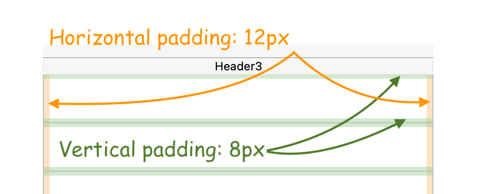
Horizontal Padding
Sets a horizontal padding for the cells. The value is set in pixels (default = 0).
JSON Grammar
| Name | Data Type | Possible Values |
|---|---|---|
| horizontalPadding | number | Number of pixels (must be >=0) |
Objects Supported
List Box - List Box Column - Footers - Headers
Commands
LISTBOX Get property - LISTBOX SET PROPERTY
See also
Vertical Padding
Sets a vertical padding for the cells. The value is set in pixels (default = 0).
JSON Grammar
| Name | Data Type | Possible Values |
|---|---|---|
| verticalPadding | number | Number of pixels (must be >=0) |
Objects Supported
List Box - List Box Column - Footers - Headers
Commands
LISTBOX Get property - LISTBOX SET PROPERTY