Components basics
Components are the fundamental building blocks that constitute your application's user interface. These modular elements allow you to construct rich and dynamic interfaces by combining various functionalities and visual elements.
Locating Components
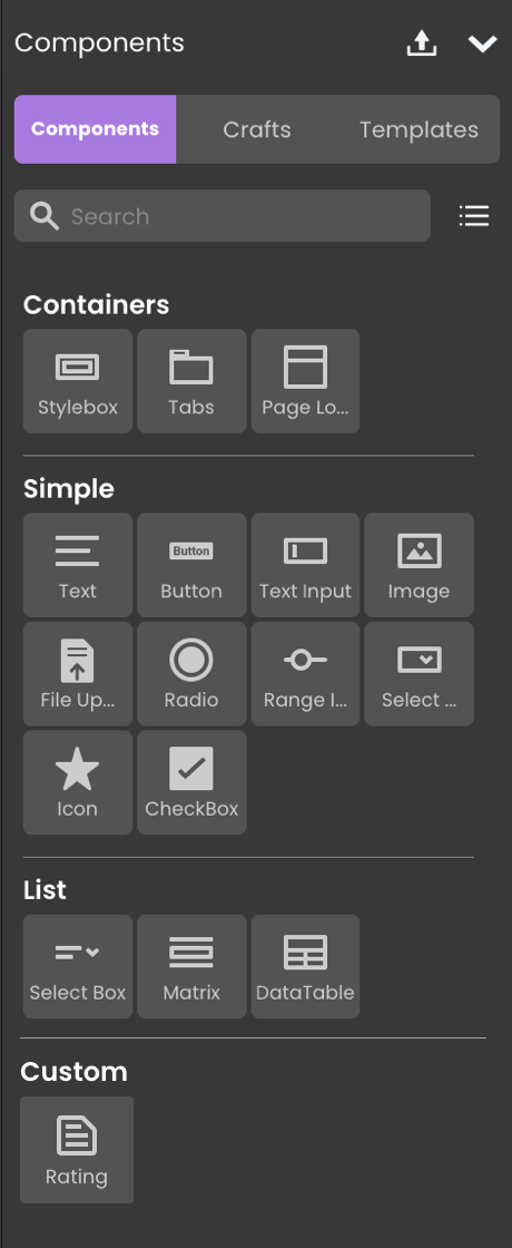
Components are located in the Components tab on the left side panel. Components are systematically organized into distinct categories, simplifying the search and selection process:
Adding Components
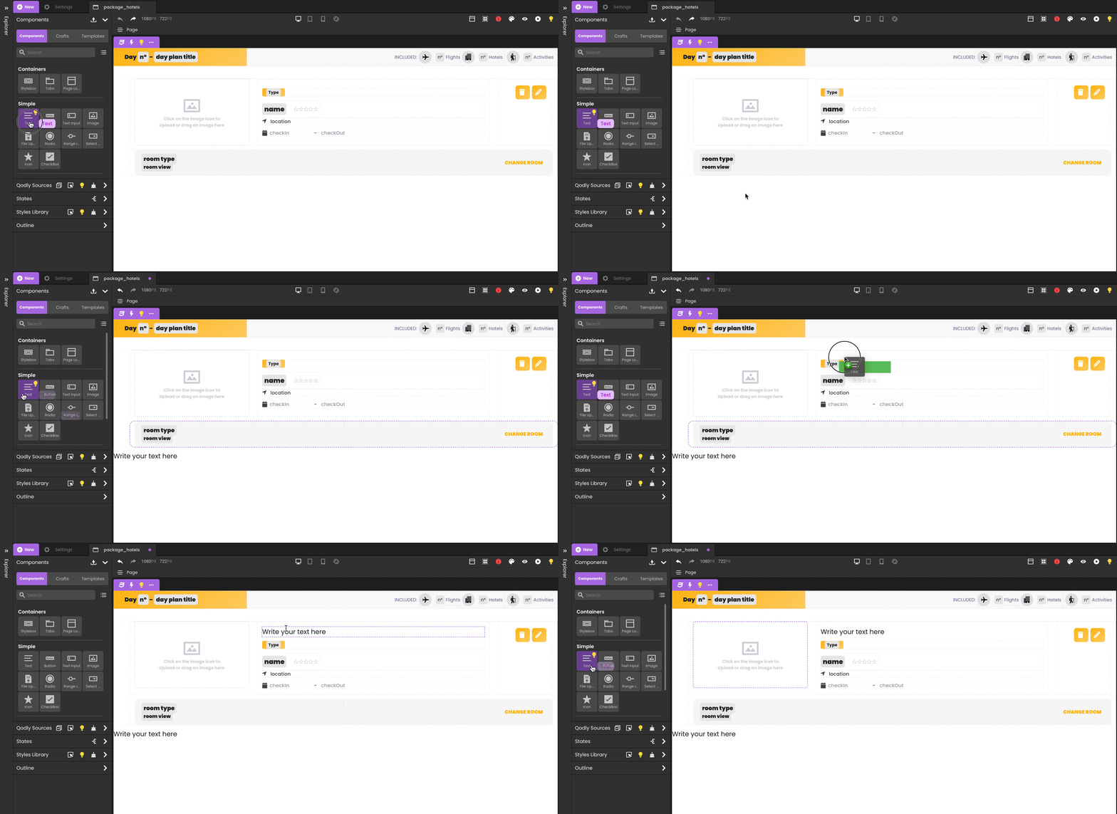
Incorporating components into your Page is a straightforward process that involves drag-and-drop functionality. Simply select a component and place it onto your working area or canvas.
You have the flexibility to drop components directly onto the Page itself, as well as within other components that accept nested elements. This versatility allows you to construct complex layouts and hierarchies by combining different components within one another.
Uploading Custom Components
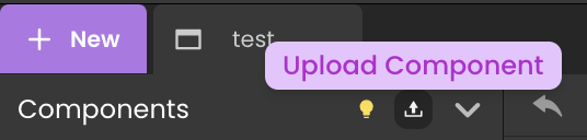
Qodly Studio provides a dedicated upload  button in the Component bar, allowing users to upload Custom Components.
Tooltip
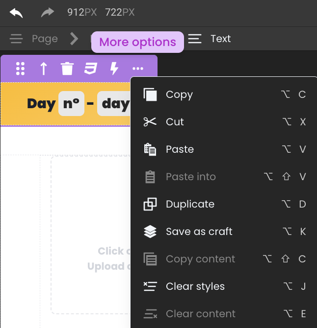
When you select a component on the canvas, a contextual tooltip becomes available, offering a variety of actions that can be performed on the chosen component. These actions provide you with the tools to efficiently manage and manipulate your Page's design. Here's a breakdown of the actions available in the tooltip:
Essential Options
| Option | Description |
|---|---|
| Move | Reposition the selected component on the canvas. |
| Select Parent Component | Select the parent component of the current selection. |
| Delete Component | Remove the selected component from the canvas. As an alternative solution, you can use the shortcut Alt + Shift + Delete (⌥ + ⇧ + Delete for Mac). |
| Export Styles | Export the overridden CSS properties to a new CSS class. |
| Open Events Panel | Binding events to the selected component. |
More Options
| Option | Description |
|---|---|
| Copy | Make a copy of the selected component. As an alternative solution, you can use the shortcut Alt + C (⌥ + C for Mac) |
| Cut | Cuts the selected component so you can paste it elsewhere. As an alternative solution, you can use the shortcut Alt + X (⌥ + X for Mac) |
| Paste | Paste the copied component directly into your Page. As an alternative solution, you can use the shortcut Alt + V (⌥ + V for Mac) |
| Paste into | Paste the copied component into another component. As an alternative solution, you can use the shortcut Alt + ⇧ + V (⌥ + ⇧ + V for Mac) |
| Duplicate | Duplicate the selected component in the same parent component. As an alternative solution, you can use the shortcut Alt + D (⌥ + D for Mac) |
| Save as craft | Save the component, its child components, and their styles as a reusable component. As an alternative solution, you can use the shortcut Alt + K (⌥ + K for Mac) |
| Copy content | Copy content. As an alternative solution, you can use the shortcut Alt + ⇧ + C (⌥ + ⇧ + C for Mac) |
| Clear styles | Clear the styles of the selected component (resets the overridden CSS properties). As an alternative solution, you can use the shortcut Alt + J (⌥ + J for Mac) |
| Clear content | Clear content within the selected component. As an alternative solution, you can use the shortcut Alt + E (⌥ + E for Mac) |
Data Formatting
Your Pages can incorporate Qodly Source attributes with data types such as string, number, date, time, or duration. When these attributes are presented within components, you have the option to choose their display format in the Properties section.
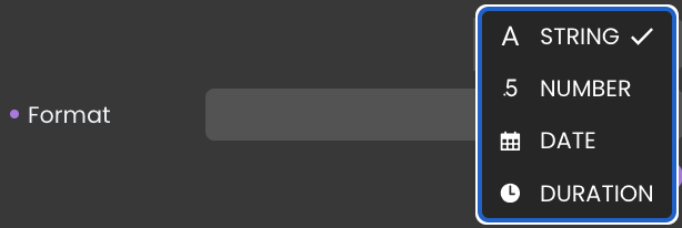
Formatting options may vary based on the specific data type of the attribute and the type of component being used.
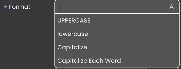
- For Text (string):
- UPPERCASE: Converts all characters to uppercase.
- lowercase: Converts all characters to lowercase.
- Capitalize: Capitalizes the first letter of the text.
- Capitalize Each Word: Capitalizes the first letter of each word.
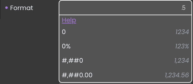
- For Number:
- 0: Standard numerical format.
- 0%: Displays the number as a percentage.
- #,##0: Adds thousands separators to the number.
- #,##0.00: Adds thousands separators and displays two decimal places.
Refer to the Review guidelines for customizing number formats.
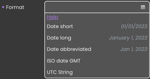
- For Date:
- Date short: Displays the date in a short format.
- Date long: Displays the date in a long format.
- Date abbreviated: Displays the date with abbreviated month name.
- ISO date GMT: Displays the date in ISO 8601 format with GMT time zone.
- UTC String: Displays the date in a UTC format.
Qodly supports a wide range of customized date formats. For a comprehensive list of available patterns, refer to the Date and Time Formats page.
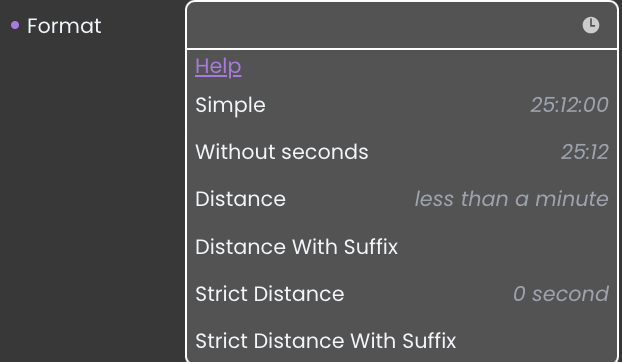
- For Duration:
- Simple: 14:40:30
- Without seconds: 14:40
- Distance: about 15 hours
- Distance with Suffix: in about 15 hours
- Strict Distance: 15 hours
- Strict Distance with Suffix: in 15 hours
Qodly supports a wide range of customized time formats. For a comprehensive list of available time patterns, refer to the Date and Time Formats page.
Styled Text Support
Data Table and Text components support styled text contents, based upon specific HTML tags. When styled text is supported, 4D interprets any <SPAN> HTML tags found in the area.
When a Qodly source contains some styled text, it is correctly interpreted and displayed in the component on the Qodly page. And, if some styled text is added or modified from a Qodly page, it is correctly interpreted and displayed in 4D forms.
The following tags are supported by Data Table and Text components:
Font name
<SPAN STYLE="font-family: DESDEMONA"> ... </SPAN>
Font size
<SPAN STYLE="font-size: 20pt"> ... </SPAN>
Font style
- Bold
<SPAN STYLE="font-weight: bold"> ... </SPAN>
- Italic or normal
<SPAN STYLE="font-style: italic"> ... </SPAN>
<SPAN STYLE="font-style: normal"> ... </SPAN>
- Underline
<SPAN STYLE="text-decoration: underline"> ... </SPAN>
- Strikethrough
<SPAN STYLE="text-decoration:line-through">...</SPAN>
Note : The "strikethrough" style is not supported under macOS.
Font colors
<SPAN STYLE="color:green"> ... </SPAN> or <SPAN STYLE="color:#006CCC">...</SPAN>
Background colors
<SPAN STYLE="background-color:green"> ... </SPAN>
or
<SPAN STYLE="background-color:#006CCC">...</SPAN>
Color values: For font color and background color attributes, the color value can be either the hexadecimal code for an RGB color, or the name of one of the 16 HTML colors defined for standard CSS by the W3C.
Character reference is supported. See https://developer.mozilla.org/en-US/docs/Glossary/Character_reference
Data Integration
This section serves as a fundamental introduction to the integration of Qodly Sources with components. It's essential to note that each component has its own dedicated section on its respective page, including the following subsections:
-
Data Binding: This step configures the connection between a component and a Qodly Source, determining where the component retrieves its data.
-
Data Display: After binding data, this section guides you in visually presenting data within the component, including configuring its appearance and additional components.
-
Dynamic Attribute Display: This section explains how a component can automatically display attributes of a selected Qodly Source, offering detailed information without extra interactions.
-
Server-Side Interaction: This section explains obtaining user selections in a server-side context when a Qodly Source is bound to a component, enabling content retrieval and use.
Please note that the following subsections (Data Binding, Data Display, Dynamic Attribute Display, and Server-Side Interaction) may or may not be applicable to all components. Their presence or absence depends on the specific component's functionality and use case.