Template.svg
The template.svg file is a basic visual representation of a template. In this file, you'll need to define areas in order to be able to add fields to your list form template from the project editor.
Here's a finished version:
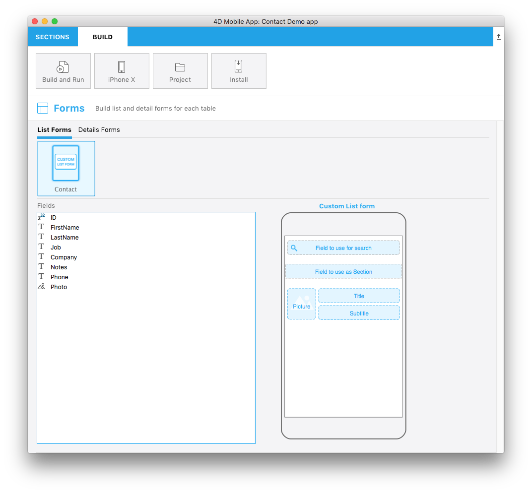
Let’s focus on the different parts of this svg file and what you'll need to edit.
Title
<title>Custom List form</title>
Title of the template.
ios:values
<text id="cookery" ios:values="search,section,f1,f2,f3"/>
Includes IDs which define your form areas:
- search: Refers to the search field area. This will allow you to drag and drop a field as the search criteria in your list form (optional).
- section: Refers to the section field area. This will allow you drag and drop a field as the sort criteria in your list form (optional).
- f1, f2 and f3: Refers to the fields to display in each cell of your list form. This will allow you to drag and drop fields to appear in your list form cells.
Area position, height, and width
You can define the position, height and width for:
- Searchfield
- Sectionfield
- Other general fields that will be displayed in each table cell
SearchableField area:
//1
<g transform="translate(0,60)”>

//2
<rect class="bg field" x="14" y="12" width="238" height="30”/>

//3
<path class="magnifyingGlass" transform="translate(20,8) scale(1)”/>

//4
<textArea id="search.label" class="label" x="14" y="8" width="238"/>

//5
<rect id="search" class="droppable field optional" x="14" y="0" width="238" height="30" stroke-dasharray="5,2" ios:type="0,1,2,4,8,9,11,25,35"  ios:bind="searchableField"/>

//6
<use id="search.cancel" x="224" y="1" xlink:href="#cancel" visibility="hidden"/>
</g>
- Entire area Y position
- Area background position, height, and width
- Icon to display a magnifying glass icon into the searchable field
- Define the text area position and width
- Define the droppable field position, height and width, as well as accepted field types
- Define a cancel button that will be displayed to delete the current content
The searchable field is optional.
SectionField area:
//1
<rect class="bg field" x="10" y="110" width="246" height="30”/>

//2
<textArea id="section.label" class="label" x="0" y="118" width="250"/>

//3
<rect id="section" class="droppable optional" x="10" y="110" width="246" height="30" stroke-dasharray="5,2" ios:type="0,1,2,4,8,9,11,25,35" ios:bind="sectionField”/>

//4
<use id="section.cancel" x="224" y="111" xlink:href="#cancel" visibility="hidden"/>
- Area background position, height and width
- Define the text area position and width
- Define the droppable field position, height and width as well as accepted field types
- Define a cancel button that will be displayed to delete the current content
The section field is optional.
ImageField area:
//1
<g transform="translate(0,162)">

//2
<rect class="bg field" x="14" y="0" width="60" height="65"/>

//3
<path class="picture" transform="translate(-60 0) scale(5)"/>

//4
<textArea id="f1.label" class="label" x="14" y="30" width="60">$4DEVAL(:C991("picture"))</textArea>

//5
<rect id="f1" class="droppable field" x="14" y="0" width="60" height="65" stroke-dasharray="5,2" ios:type="3" ios:bind="fields[0]"/>

//6
<use id="f1.cancel" x="47" y="-2" xlink:href="#cancel" visibility="hidden"/>
</g>
- Entire area Y position
- Area background position, height and width
- Icon to display an image in the imageField
- Define the text area position and width
- Define the droppable field position, height and width as well as accepted field types
- Define a cancel button that will be displayed to delete the current content
Title Field area:
//1
<g transform="translate(0,162)”>

//2
<rect class="bg field" x="84" y="0" width="168" height="30”/>

//3
<textArea id="f2.label" class="label" x="84" y="8" width="168">$4DEVAL(:C991("titleField"))</textArea>

//4
<rect id="f2" class="droppable field" x="84" y="0" width="168" height="30" stroke-dasharray="5,2" ios:type="0,1,2,4,8,9,11,25,35" ios:bind="fields[1]”/>

//5
<use id="f2.cancel" x="224" y="1" xlink:href="#cancel" visibility="hidden"/>
</g>
- Entire area Y position
- Area background position, height and width
- Define the text area position and width
- Define the droppable field position, height and width as well as accepted field types
- Define a cancel button that will be displayed to delete the current content
Subtitle Field area:
//1
<g transform="translate(0,198)”>

//2
<rect class="bg field" x="84" y="0" width="168" height="30”/>

//3
<textArea id="f3.label" class="label" x="84" y="8" width="168">$4DEVAL(:C991("subtitleField"))</textArea>

//4
<rect id="f3" class="droppable field" x="84" y="0" width="168" height="30" stroke-dasharray="5,2" ios:type="0,1,2,4,8,9,11,25,35" ios:bind="fields[2]”/>

//5
<use id="f3.cancel" x="224" y="1" xlink:href="#cancel" visibility="hidden"/>
</g>
- Entire area Y position
- Area background position, height and width
- Define the text area position and width
- Define the droppable field position, height and width as well as accepted field types
- Define a cancel button that will be displayed to delete the current content
ios:types
The following field types are supported:
| Code | Type |
|---|---|
| 0 | alpha |
| 1 | real |
| 2 | text |
| 3 | picture |
| 4 | date |
| 8 | integer |
| 9 | longint |
| 11 | time |
| 25 | integer 64 bit |
For more information on these field types, refer to this page.
To make field type definition easier, 4D for iOS allows you to include field types with positive values and also exclude field types with negative values. For example, ios:type="-3,-4" will allow you to drag and drop every field except images and dates.
To include all types, just type ios:type="all".