Template.svg
template.svg は、テンプレートのレイアウトを視覚的に表現するためのファイルです。 プロジェクトエディターでリストフォームのテンプレートにフィールドが追加できるように、ドラッグ&ドロップ用のエリアを定義しておきます。
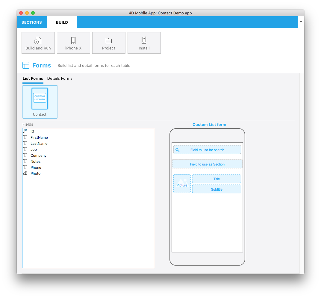
図は完成したファイルのイメージです。
この svgファイルの各部分の役割とカスタマイズできる箇所を見ていきましょう。
タイトル
<title>Custom List form</title>
テンプレートの名称をここに指定します。
ios:values
<text id="cookery" ios:values="search,section,f1,f2,f3"/>
リストフォームに配置されたフィールドを特定するための情報が記述されています:
- search: 検索フィールドのことです。 このエリアにドラッグ&ドロップしたフィールドは、リストに表示されるレコードの検索に使用されます (任意)。
- section: セクションフィールドのことです。 このエリアにドラッグ&ドロップしたフィールドは、リスト表示されるレコードの並び替えに使用されます (任意)。
- f1, f2, f3: リストフォームの各行 (セル) に表示されるフィールドです。 セルに表示されるフィールドは、ドラッグ&ドロップで追加することができます。
エリアの位置・サイズ
下記のエリアについて、位置とサイズを指定できます:
- 検索フィールド
- セクションフィールド
- 各行 (セル) に表示されるフィールド
検索フィールド:
//1
<g transform="translate(0,60)”>

//2
<rect class="bg field" x="14" y="12" width="238" height="30”/>

//3
<path class="magnifyingGlass" transform="translate(20,8) scale(1)”/>

//4
<textArea id="search.label" class="label" x="14" y="8" width="238"/>

//5
<rect id="search" class="droppable field optional" x="14" y="0" width="238" height="30" stroke-dasharray="5,2" ios:type="0,1,2,4,8,9,11,25,35"  ios:bind="searchableField"/>

//6
<use id="search.cancel" x="224" y="1" xlink:href="#cancel" visibility="hidden"/>
</g>
- エリア全体の垂直位置 (g 要素)
- エリアの背景位置とサイズ (rect 要素)
- 検索フィールドに表示されるルーペアイコン (path 要素)
- 入力エリアの位置とサイズ (textArea 要素)
- フィールドをドロップできるエリアの位置とサイズ、およびドロップ可能な フィールドタイプ (rect 要素)
- 内容をクリアするためのキャンセルボタン (use 要素)
検索フィールドを使用することは必須ではありません。
セクションフィールド:
//1
<rect class="bg field" x="10" y="110" width="246" height="30”/>

//2
<textArea id="section.label" class="label" x="0" y="118" width="250"/>

//3
<rect id="section" class="droppable optional" x="10" y="110" width="246" height="30" stroke-dasharray="5,2" ios:type="0,1,2,4,8,9,11,25,35" ios:bind="sectionField”/>

//4
<use id="section.cancel" x="224" y="111" xlink:href="#cancel" visibility="hidden"/>
- エリアの背景位置とサイズ (rect 要素)
- 入力エリアの位置とサイズ (textArea 要素)
- フィールドをドロップできるエリアの位置とサイズ、およびドロップ可能な フィールドタイプ (rect 要素)
- 内容をクリアするためのキャンセルボタン (use 要素)
セクションフィールドを使用することは必須ではありません。
ピクチャーフィールド:
//1
<g transform="translate(0,162)">

//2
<rect class="bg field" x="14" y="0" width="60" height="65"/>

//3
<path class="picture" transform="translate(-60 0) scale(5)"/>

//4
<textArea id="f1.label" class="label" x="14" y="30" width="60">$4DEVAL(:C991("picture"))</textArea>

//5
<rect id="f1" class="droppable field" x="14" y="0" width="60" height="65" stroke-dasharray="5,2" ios:type="3" ios:bind="fields[0]"/>

//6
<use id="f1.cancel" x="47" y="-2" xlink:href="#cancel" visibility="hidden"/>
</g>
- エリア全体の垂直位置 (g 要素)
- エリアの背景位置とサイズ (rect 要素)
- ピクチャーエリアに表示されるアイコン画像 (path 要素)
- 入力エリアの位置とサイズ (textArea 要素)
- フィールドをドロップできるエリアの位置とサイズ、およびドロップ可能な フィールドタイプ (rect 要素)
- 内容をクリアするためのキャンセルボタン (use 要素)
タイトルフィールド:
//1
<g transform="translate(0,162)”>

//2
<rect class="bg field" x="84" y="0" width="168" height="30”/>

//3
<textArea id="f2.label" class="label" x="84" y="8" width="168">$4DEVAL(:C991("titleField"))</textArea>

//4
<rect id="f2" class="droppable field" x="84" y="0" width="168" height="30" stroke-dasharray="5,2" ios:type="0,1,2,4,8,9,11,25,35" ios:bind="fields[1]”/>

//5
<use id="f2.cancel" x="224" y="1" xlink:href="#cancel" visibility="hidden"/>
</g>
- エリア全体の垂直位置 (g 要素)
- エリアの背景位置とサイズ (rect 要素)
- 入力エリアの位置とサイズ (textArea 要素)
- フィールドをドロップできるエリアの位置とサイズ、およびドロップ可能な フィールドタイプ (rect 要素)
- 内容をクリアするためのキャンセルボタン (use 要素)
サブタイトルフィールド
//1
<g transform="translate(0,198)”>

//2
<rect class="bg field" x="84" y="0" width="168" height="30”/>

//3
<textArea id="f3.label" class="label" x="84" y="8" width="168">$4DEVAL(:C991("subtitleField"))</textArea>

//4
<rect id="f3" class="droppable field" x="84" y="0" width="168" height="30" stroke-dasharray="5,2" ios:type="0,1,2,4,8,9,11,25,35" ios:bind="fields[2]”/>

//5
<use id="f3.cancel" x="224" y="1" xlink:href="#cancel" visibility="hidden"/>
</g>
- エリア全体の垂直位置 (g 要素)
- エリアの背景位置とサイズ (rect 要素)
- 入力エリアの位置とサイズ (textArea 要素)
- フィールドをドロップできるエリアの位置とサイズ、およびドロップ可能な フィールドタイプ (rect 要素)
- 内容をクリアするためのキャンセルボタン (use 要素)
ios:types
以下のフィールドタイプがサポートされています:
| コード | タイプ |
|---|---|
| 0 | 文字 |
| 1 | 実数 |
| 2 | テキスト |
| 3 | ピクチャー |
| 4 | 日付 |
| 8 | 整数 |
| 9 | 倍長整数 |
| 11 | 時間 |
| 25 | 整数64bit |
注
これらのフィールドタイプの詳細については、このページ を参照ください。
tip
ドロップできるフィールドタイプは 正の値 で指定し、できないフィールドは 負の値 で指定します。 たとえば、ios:type="-3,-4" の場合、ピクチャーと日付以外のフィールドがドロップ可能、という意味になります。 すべてのタイプをサポートする場合は、ios:type="all" と指定します。