Styling
Once a component is on the Canvas, you can customize its look using styling tools.
Styles Library#
One way of styling components is by dragging CSS classes from the Styles Library and dropping them on the components.
The Styles Library offers two types of styles:
- Local: Styles you create
- Theme: Predefined CSS classes
Unlike Theme classes, Local styles can only be used in the Webforms in which they are created.
To create a local CSS class, click the "+" button and enter a name. CSS classes can be edited in the Contextual panel at the bottom.
Inspect button#
The Inspect option allows you to check where your CSS classes are used in your webforms. Toggle the option by clicking the icon, then mouse over a CSS class to highlight its location in your webform.
Properties panel#
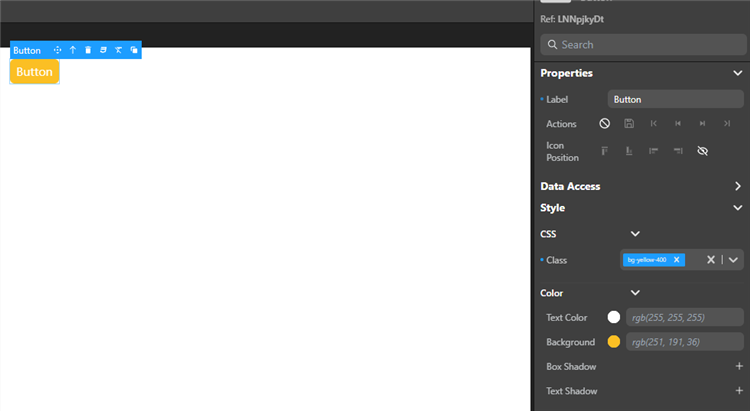
The Properties panel gives you extremely granular control over your elements.
After you select an element, you can edit its properties using this panel. This includes style properties (as a rule, component properties and styling are separated).
Using the Properties panel, you can bind a CSS class to the element and define values individually.

Some visual properties such as grid areas or datatable columns can be edited directly on the canvas.
Example#
To add a red background to a Button component:
from the Styles library: drag the
bg-red-500class from the Styles library and drop it on the Button component.using the Properties Panel:
- select the Button component, and under Style, choose a red color for the background.
- select the Button component, then in the Properties panel, select the
bg-red-500class in the CSS section.
Overriding style properties#
Selecting a component displays its style properties in the Properties Panel. Values set by CSS classes are displayed in italics. For example, assigning the bg-red-500 class to the component will get the Background property to display rgb(239,68,68).
Modifying these values overrides the initial value for that property. Overriden CSS properties have a blue dot in front of them.
You can export the new values to create a new CSS class.
Working with CSS#
Exporting styles as CSS classes for reuse#
You can export the style of an element as a CSS class to reuse it later:
- Select a an element on the canvas, the tooltip appears.
- Click the CSS icon in the tooltip and enter a name for the new CSS class.
- Click Export.
note
This does not export all the styles of the component, only the properties you override.
This exports the new style properties of the element as a new local CSS class. Now it appears as a choice in the Styles library and in the property list, and you can apply the class to other elements on your canvas.
Editing a CSS class#
Once a local class is created, you can hover over it in the Styles Library and click the Edit Class button next to its name to edit the CSS directly. The changes apply to all the components using this class.
See also#
If you're not familiar with CSS properties and styles, or you need a refresher, here are a few useful links and tools:
- Learn CSS on the MDN website
- A guide to flexbox properties on css-tricks.com
- Box-shadow examples, box-shadow generator