Text
Permitir a selecção de tipo de letra/cor
When this property is enabled, the OPEN FONT PICKER and OPEN COLOR PICKER commands can be called to display the system font and color picker windows. Using these windows, the users can change the font or color of a form object that has the focus directly by clicking. When this property is disabled (default), the open picker commands have no effect.
Gramática JSON
| Propriedade | Tipo de dados | Valores possíveis |
|---|---|---|
| allowFontColorPicker | boolean | false (padrão), true |
Objectos suportados
Negrito
Define o texto selecionado para aparecer mais escuro e mais pesado.
You can set this property using the OBJECT SET FONT STYLE command.
This is normal text.
This is bold text.
Gramática JSON
| Propriedade | Tipo de dados | Valores possíveis |
|---|---|---|
| fontWeight | text | "normal", "bold" |
Objectos suportados
Button - Check Box - Combo Box - Drop-down List - Group Box - Hierarchical List - Input - List Box - List Box Column - List Box Footer - List Box Header - Radio Button - Text Area
Itálico
Define o texto selecionado como ligeiramente inclinado para a direita.
You can also set this property via the OBJECT SET FONT STYLE command.
This is normal text.
This is text in italics.
Gramática JSON
| Nome | Tipo de dados | Valores possíveis |
|---|---|---|
| fontStyle | string | "normal", "italic" |
Objectos suportados
Button - Check Box - Combo Box - Drop-down List - Group Box - Hierarchical List - Input - List Box - List Box Column - List Box Footer - List Box Header - Radio Button - Text Area
Sublinhado
Define o texto para ter uma linha por baixo.
Gramática JSON
| Nome | Tipo de dados | Valores possíveis |
|---|---|---|
| textDecoration | string | "normal", "underline" |
Objectos suportados
Button - Check Box - Combo Box - Drop-down List - Group Box - Hierarchical List - Input - List Box - List Box Column - List Box Footer - List Box Header - Radio Button - Text Area
Fonte
This property allows you to specify either the font theme or the font family used in the object.
Font theme and font family properties are mutually exclusive. Um tema de tipo de letra controla os atributos do tipo de letra, incluindo o tamanho. Uma família de tipos de letra permite-lhe definir o nome, o tamanho e a cor do tipo de letra.
Tema Fonte
A propriedade de tema do tipo de letra designa um nome de estilo automático. Automatic styles determine the font family, font size and font color to be used for the object dynamically according to system parameters. Esses parâmetros dependem de:
- a plataforma,
- a língua do sistema,
- e o tipo de objeto do formulário.
With the font theme, you are guaranteed that titles are always displayed in accordance with the current interface standards of the system. No entanto, o seu tamanho pode variar de uma máquina para outra.
Estão disponíveis três temas de tipos de letra:
- normal: automatic style, applied by default to any new object created in the Form editor.
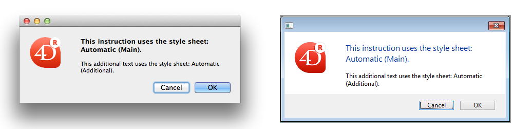
- main and additional font themes are only supported by text areas and inputs. Estes temas destinam-se principalmente a desenho de caixas de diálogo. They refer to font styles used, respectively, for main text and additional information in your interface windows. Aqui estão as caixas de diálogo típicas (macOS e Windows) que utilizam estes temas de tipos de letra:
Os temas de tipo de letra gerem o tipo de letra, bem como o seu tamanho e cor. Entretanto, pode aplicar propriedades de estilo personalizadas (Negrito, Itálico ou Subscrito) sem alterar seu funcionamento.
Gramática JSON
| Nome | Tipo de dados | Valores possíveis |
|---|---|---|
| fontTheme | string | "normal", "main", "additional" |
Objectos suportados
Button - Check Box - Combo Box - Drop-down List - Group Box - Hierarchical List - Input - List Box - List Box Column - List Box Footer - List Box Header - Radio Button - Text Area
Família de letras
Existem dois tipos de nomes de famílias de letras:
- family-name: The name of a font-family, like "times", "courier", "arial", etc.
- generic-family: The name of a generic-family, like "serif", "sans-serif", "cursive", "fantasy", "monospace".
You can set this using the OBJECT SET FONT command.
Gramática JSON
| Nome | Tipo de dados | Valores possíveis |
|---|---|---|
| fontFamily | string | Nome da família de fontes CSS |
4D recommends using only web safe fonts.
Objectos suportados
Button - Check Box - Combo Box - Drop-down List - Group Box - Hierarchical List - Input - List Box - List Box Column - List Box Footer - List Box Header - Radio Button - Text Area
Tamanho fonte
Permite definir o tamanho da fonte do objeto em pontos.
Gramática JSON
| Nome | Tipo de dados | Valores possíveis |
|---|---|---|
| fontSize | integer | Tamanho da letra em pontos. Valor mínimo: 0 |
Objectos suportados
Button - Check Box - Combo Box - Drop-down List - Group Box - Hierarchical List - Input - List Box - List Box Column - List Box Footer - List Box Header - Radio Button - Text Area
Cor fonte
Designa a cor do tipo de letra.
This property also sets the color of object's border (if any) when "plain" or "dotted" style is used.
A cor pode ser especificada por:
- um nome de cor - como "red"
- um valor HEX - como "#ff0000"
- um valor RGB - como "rgb(255,0,0)"
You can also set this property using the OBJECT SET RGB COLORS command.
Gramática JSON
| Nome | Tipo de dados | Valores possíveis |
|---|---|---|
| stroke | string | um valor css, "transparent", "automatic" |
Objectos suportados
Button - Check Box - Combo Box - Drop-down List - Group Box - Hierarchical List - Input - List Box - List Box Column - List Box Footer - List Box Header - Progress Indicators - Ruler - Radio Button - Text Area
Expressão cor fonte
Selection and collection/entity selection type list boxes
Utilizado para aplicar uma cor de letra personalizada a cada linha do list box. É necessário utilizar valores de cor RGB. For more information about this, refer to the description of the OBJECT SET RGB COLORS command in the 4D Language Reference manual.
Deve introduzir uma expressão ou uma variável (não podem ser utilizadas variáveis do tipo array). A expressão ou variável será avaliada para cada linha exibida. You can use the constants of the SET RGB COLORS theme.
You can also set this property using the LISTBOX SET PROPERTY command with lk font color expression constant.
This property can also be set using a Meta Info Expression.
The following example uses a variable name: enter CompanyColor for the Font Color Expression and, in the form method, write the following code:
CompanyColor:=Choose([Companies]ID;Background color;Light shadow color; Foreground color;Dark shadow color)
Gramática JSON
| Nome | Tipo de dados | Valores possíveis |
|---|---|---|
| rowStrokeSource | string | Expressão cor fonte |
Objectos suportados
Expressão estilo
Selection and collection/entity selection type list boxes
Utilizado para aplicar um estilo de carácter personalizado a cada linha do list box ou a cada célula da coluna.
Deve introduzir uma expressão ou uma variável (não podem ser utilizadas variáveis do tipo array). A expressão ou variável será avaliada para cada linha apresentada (se aplicada à list box) ou para cada célula apresentada (se aplicada a uma coluna). You can use the constants of the Font Styles theme.
Exemplo:
Choose([Companies]ID;Bold;Plain;Italic;Underline)
You can also set this property using the LISTBOX SET PROPERTY command with lk font style expression constant.
This property can also be set using a Meta Info Expression.
Gramática JSON
| Nome | Tipo de dados | Valores possíveis |
|---|---|---|
| rowStyleSource | string | Expressão de estilo a avaliar para cada linha/célula. |
Objectos suportados
Alihamento horizontal
Localização horizontal do texto na área que o contém.
Gramática JSON
| Nome | Tipo de dados | Valores possíveis |
|---|---|---|
| textAlign | string | "right", "center", "left", "automatic", "justify" |
- "automatic" is not supported by check boxes and radio buttons
- "justify" is only supported by inputs and text areas
Objectos suportados
Button - Check Box (all styles except Regular and Flat) - Group Box - Input - List Box - List Box Column - List Box Header - List Box Footer - Radio Button (all styles except Regular and Flat) - Text Area
Cor linha vertical
Localização vertical do texto na área que o contém.
The Default option (automatic JSON value) sets the alignment according to the type of data found in each column:
bottomfor all data (except pictures) andtopfor picture type data.
This property can also be handled by the OBJECT Get vertical alignment and OBJECT SET VERTICAL ALIGNMENT commands.
Gramática JSON
| Nome | Tipo de dados | Valores possíveis |
|---|---|---|
| verticalAlign | string | "automatic", "top", "middle", "bottom" |
Objectos suportados
List Box - List Box Column - List Box Footer - List Box Header
Meta Info expression
Collection or entity selection type list boxes
Especifica uma expressão ou uma variável que será avaliada para cada linha exibida. Permite definir um conjunto completo de atributos de texto das linhas. You must pass an object variable or an expression that returns an object. As propriedades abaixo são compatíveis:
| Nome da propriedade | Tipo | Descrição |
|---|---|---|
| stroke | string | Background color. Any CSS color (ex: "#F00FFF"), "automatic", "transparent" |
| fill | string | Cor de fundo. Any CSS color (ex: "#FF00FF"), "automatic", "transparent" |
| fontStyle | string | "normal","italic" |
| fontWeight | string | "normal","bold" |
| textDecoration | string | "normal","underline" |
| unselectable | boolean | Designates the corresponding row as not being selectable (i.e., highlighting is not possible). As áreas inseríveis deixam de o ser se esta opção estiver ativada, a menos que a opção "Editar com um clique" também esteja ativada. Os controlos como as caixas de verificação e as listas permanecem funcionais. Esta definição é ignorada se o modo de seleção do list box é "Nenhum". This setting is ignored if the list box selection mode is "None". |
| disabled | boolean | Desactiva a linha correspondente. As áreas acessíveis deixam de ser acessíveis se esta opção estiver activada. Text and controls (checkboxes, lists, etc.) appear dimmed or grayed out. This setting is ignored if the list box selection mode is "None". |
A propriedade especial "célula" permite-lhe aplicar um conjunto de propriedades a uma única coluna:
| Nome da propriedade | Tipo | Descrição | ||
|---|---|---|---|---|
| cell | object | Allows applying the property to a single column. | ||
| columnName | object | columnName is the object name of the list box column | ||
| propertyName | string | as propriedades "stroke", "fill", "fontStyle", "fontWeight" ou "textDecoration" (ver acima). Note: "unselectable" and "disabled" properties can only be defined at row level. São ignorados se forem passados no objeto "célula" |
Style settings made with this property are ignored if other style settings are already defined through expressions (i.e., Style Expression, Font Color Expression, Background Color Expression).
Examples
In a Color project method, write the following code:
//Color method
//Sets font color for certain rows and background color for Col2 and Col3 columns
Form.meta:=New object
If(This.ID>5) //ID is an attribute of collection objects/entities
  Form.meta.stroke:="purple"
  Form.meta.cell:=New object("Col2";New object("fill";"black");\
    "Col3";New object("fill";"red"))
Else
  Form.meta.stroke:="orange"
End if
Best Practice: For optimization reasons, it is usually recommended to create the meta.cell object once in the form method:
  //form method
 Case of
    :(Form event code=On Load)
       Form.colStyle:=New object("Col2";New object("fill";"black");\
        "Col3";New object("fill";"red"))
 // you can also define other style sets
       Form.colStyle2:=New object("Col2";New object("fill";"green");\
        "Col3";New object("fontWeight";"bold"))
 End case
Then, the Color method would contain:
  //Color method
 ...
 If(This.ID>5)
    Form.meta.stroke:="purple"
    Form.meta.cell:=Form.colStyle //reuse the same object for better performance
 Else
    Form.meta.stroke:="orange"
    Form.meta.cell:=Form.colStyle2
 End if
 ...
Gramática JSON
| Nome | Tipo de dados | Valores possíveis |
|---|---|---|
| metaSource | string | Expressão do objeto a avaliar para cada linha/célula. |
Objectos suportados
Multistyle
Esta propriedade ativa a possibilidade de usar estilos específicos na área selecionada. When this option is checked, 4D interprets any <SPAN> HTML tags found in the area.
Por defeito, esta opção não está activada.
Gramática JSON
| Nome | Tipo de dados | Valores possíveis |
|---|---|---|
| styledText | boolean | true, false |
Objectos suportados
Orientação
Modifica a orientação (rotação) de uma área texto. Áreas texto pode ser rodadas por incrementos de 90°. Cada valor de orientação é aplicado enquanto mantém o mesmo ponto inferior esquerdo para o objeto:
| Valor de orientação | Resultados |
|---|---|
| 0 (o padrão) |  |
| 90 |  |
| 180 |  |
| 270 |  |
In addition to static text areas, input text objects can be rotated when they are non-enterable. Quando uma propriedade rotação for aplicada a um objeto input, a propriedade digitável é removida (se houver). Esse objeto é então excluído da ordem de entrada.
Gramática JSON
| Nome | Tipo de dados | Valores possíveis |
|---|---|---|
| textAngle | number | 0, 90, 180, 270 |
Objectos suportados
Input (non-enterable) - Text Area
Array cores de Fonte
Array type list boxes
Permite estabelecer uma cor de fonte personalizada para cada linha do list box ou cada célula da coluna.
O nome do array LongInt deve ser usado. Cada elemento deste array corresponde a uma linha do list box (se aplicada o list box) ou a uma célula da coluna (se aplicada a uma coluna), pelo que o array deve ter o mesmo tamanho que o array associado à coluna. You can use the constants of the SET RGB COLORS theme. Se você quiser que a célula herde a cor de fundo definida no nível superior, passe o valor -255 para o elemento de array correspondente.
Gramática JSON
| Nome | Tipo de dados | Valores possíveis |
|---|---|---|
| rowStrokeSource | string | O nome de um array longint |
Objectos suportados
Array estilo linha
Array type list boxes
Permite estabelecer um estilo de fonte personalizado para cada linha do list box ou cada célula da coluna.
O nome do array LongInt deve ser usado. Cada elemento deste array corresponde a uma linha do list box (se aplicada o list box) ou a uma célula da coluna (se aplicada a uma coluna), pelo que o array deve ter o mesmo tamanho que o array associado à coluna. To fill the array (using a method), use the constants of the Font Styles theme. Pode acionar constantes juntas para combinar estilos. Se quiser que a célula herde o estilo definido no nível mais alto, passe o valor -255 para o elemento array correspondente.
Gramática JSON
| Nome | Tipo de dados | Valores possíveis |
|---|---|---|
| rowStyleSource | string | O nome de um array longint. |
Objectos suportados
Armazenar com etiquetas de estilo predefinidas
This property is only available for a Multi-style input area. Quando essa propriedade for ativada, a área armazena as tags de estilo com o texto, mesmo se nenhuma modificação for feita. Nesse caso, as tags correspondem ao estilo padrão. Quando essa propriedade for desativada, só as tags de estilo modificadas são armazenadas.
Por exemplo, aqui está um texto que inclui uma modificação de estilo:
Quando a propriedade for desativada, a área só armazena a modificação. Os conteúdos armazenados são entretanto:
What a <SPAN STYLE="font-size:13.5pt">beautiful</SPAN> day!
Quando a propriedade for ativada, a área armazena todas as informações de formatação. A primeira tag genérica descreve o estilo padrão quando cada variação no sujeito for um par de tags aninhadas. Os conteúdos armazenados na área são portanto:
<SPAN STYLE="font-family:'Arial';font-size:9pt;text-align:left;font-weight:normal;font-style:normal;text-decoration:none;color:#000000;background-color:#FFFFFF">What a <SPAN STYLE="font-size:13.5pt">beautiful</SPAN> day!</SPAN>
Gramática JSON
| Nome | Tipo de dados | Valores possíveis |
|---|---|---|
| storeDefaultStyle | boolean | true, false (padrão). |